How to make responsive Navbar with dropdown menu using Tailwind CSS and CSS in React or Next.js?
Responsive Navbar with dropdown menu using Tailwind CSS and CSS Including Ready-to-Use Code Snippets for Easy Implementation in Your Project.
Live example
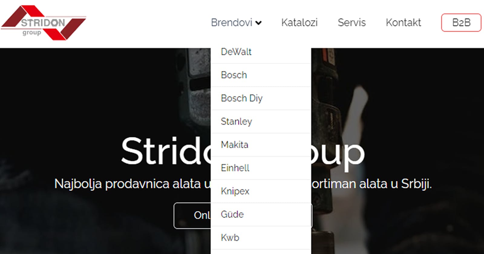
This is an example of how I implemented it on one of my projects, Stridon.
You can just copy-paste the code
If you want to explore how it's made in-depth, check out this youtube video.
JSX
import Image from "next/image";
import Link from "next/link";
import React, { useState } from "react";
import { AiOutlineMenu, AiOutlineClose } from "react-icons/ai";
import { FaAngleDown } from "react-icons/fa";
import stridon from "../../public/stridon-prodavnica-alata.webp";

const Navbar = () => {
  const [navbar, setNavbar] = useState(false);

  const navHandler = () => {
    setNavbar(!navbar);
  };

  return (
    <div>
      <div className="nav-container">
        <div
          style={{ backgroundColor: `white` }}
          className="fixed left-0 top-0 w-full z-10 shadow-md"
        >
          <div className="max-w-[1140px] m-auto flex justify-between items-center p-2.5 text-white">
            //logo
            <Link href="/">
              <Image priority src={stridon} alt="/" width={140} height={140} />

            //nav links
            </Link>
            <ul className="hidden sm:flex text-zinc-950">
              <li className="nav-link pb-4 pt-4 pr-7  hover:text-slate-700 duration-200">
                <Link href="/brendovi">
                  <div className="flex">
                    Brendovi{" "}
                    <FaAngleDown className="mt-1 ml-0.5 text-zinc-950" />
                  </div>
                </Link>
                <div className="dropdown">
                  <ul className="leading-5">
                    <li className="dropdown-link">
                      <Link href="/brendovi/dewalt">DeWalt</Link>
                    </li>
                    <li className="dropdown-link">
                      <Link href="/brendovi/bosch">Bosch</Link>
                    </li>
                    <li className="dropdown-link">
                      <Link href={"/brendovi/boschdiy"}>Bosch Diy</Link>
                    </li>
                    <li className="dropdown-link">
                      <Link href={"/brendovi/stanley"}>Stanley</Link>
                    </li>
                    <li className="dropdown-link">
                      <Link href={"/brendovi/makita"}>Makita</Link>
                    </li>

                  </ul>
                </div>
              </li>
              <li className="pb-4 pt-4 pr-8 hover:text-slate-700 duration-200">
                <Link href="/katalozi">Katalozi</Link>
              </li>
              <li className="pb-4 pt-4 pr-8 hover:text-slate-700 duration-200">
                <Link href="/servis">Servis</Link>
              </li>

              <li className="pb-4 pt-4 pr-8 hover:text-slate-700 duration-200">
                <Link href="/kontakt">Kontakt</Link>
              </li>
              <li className="pb-4 pt-4 pr-2 hover:text-slate-700 duration-200 ">
                <Link
                  className="border border-red-500 hover:bg-red-100 rounded-md py-1 px-4"
                  href="/b2b"
                >
                  B2B
                </Link>
              </li>
            </ul>

            //Mobile Button
            <div onClick={navHandler} className="block sm:hidden z-10">
              {navbar ? (
                <AiOutlineClose size={20} className="text-white" />
              ) : (
                <AiOutlineMenu size={20} className="text-zinc-950" />
              )}
            </div>
            //Mobile Menu
            <div
              className={
                navbar
                  ? "sm:hidden absolute top-0 left-0 right-0 bottom-0 flex pt-14 pl-6 w-full h-screen bg-black ease-in duration-200 "
                  : "sm:hidden absolute top-0 left-[-100%] right-0 bottom-0 flex pt-14 pl-6  w-full h-screen bg-black ease-in duration-200"
              }
            >
              <ul>
                <li
                  onClick={navHandler}
                  className="pl-0 pr-4 pt-3 pb-3 text-2xl hover:text-gray-500"
                >
                  <Link href="/brendovi">Brendovi</Link>
                </li>
                <li
                  onClick={navHandler}
                  className="pl-0 pr-4 pt-3 pb-3 text-2xl hover:text-gray-500"
                >
                  <Link href="/katalozi">Katalozi</Link>
                </li>
                <li
                  onClick={navHandler}
                  className="pl-0 pr-4 pt-3 pb-3 text-2xl hover:text-gray-500"
                >
                  <Link href="/servis">Servis</Link>
                </li>
                <li
                  onClick={navHandler}
                  className="pl-0 pr-4 pt-3 pb-3 text-2xl hover:text-gray-500"
                >
                  <Link href="/kontakt">Kontakt</Link>
                </li>
                <li
                  onClick={navHandler}
                  className="pl-0 pr-4 pt-3 pb-3 text-2xl hover:text-gray-500"
                >
                  <Link href="/b2b">B2B</Link>
                </li>
                <li
                  onClick={navHandler}
                  className="pl-0 pr-4 pt-3 pb-3 text-2xl hover:text-gray-500"
                >
                  <Link href="/onama">O nama</Link>
                </li>
              </ul>
            </div>
          </div>
        </div>
      </div>
    </div>
  );
};

export default Navbar;
CSS
//css
.dropdown{
    position: absolute;
    top: 100%;
    left: 0;
    width: 10rem;
    transform: translateY(10px);
    opacity: 0;
    pointer-events: none;
    transition: .5s;
  }

  .dropdown ul{
    position: relative;
  }

  .dropdown-link > a{
    display: flex;
    background-color: #fff;
    color: #000000;
    padding: .5rem 1rem;
    font-size: .9rem;
    align-items: center;
    justify-content: space-between;
  }

  .dropdown-link:hover > a{
    background-color: #ececec;
    color: #000000;
  }

  .dropdown-link:not(:nth-last-child(2)){
    border-bottom: 1px solid #efefef;
  }

  .dropdown-link{
    position: relative;
  }

  .nav-link:hover > .dropdown,
  .dropdown-link:hover > .dropdown{
    transform: translate(0, 0);
    opacity: 1;
    pointer-events: auto;
  }
Code explanation
Import required modules
The code starts by importing necessary modules and components from external libraries. These include Image and Link from Next.js, and various icons from react-icons. Additionally, the code uses React and useState to handle state in functional components.
Set up the Navbar component
The Navbar component is defined as a functional component called Navbar. Inside the component, a state variable called navbar is created using useState, which helps to manage the visibility of the mobile menu. The navHandler function is defined to toggle the value of navbar when the mobile menu button is clicked.
Build the Navbar HTML structure
The Navbar's HTML structure is created using a combination of Tailwind CSS classes and custom styles. The logo image is wrapped in a Link component to make it clickable and redirect to the homepage. The main navigation links are placed inside an unordered list (ul) and are hidden on small screens using hidden sm:flex. This makes them visible only on screens larger than the small breakpoint (sm). The "Brendovi" link has a dropdown menu, which appears when users hover over it. The dropdown menu is created using nested ul elements and styled with custom CSS classes.
Implement the Mobile Button and Menu
The mobile menu button is displayed for small screens only (sm:hidden) and is given an onClick event handler to trigger the navHandler function. The mobile menu itself is displayed conditionally based on the navbar state. If navbar is true, the mobile menu is visible with a smooth slide-in effect, and if it's false, the mobile menu is hidden off the screen.
Additional Navigation Links
The remaining navigation links are listed after the "Brendovi" link and are styled to change color on hover.
Export the Navbar Component
The Navbar component is exported to be used in other parts of the application. That's it! With this code, you have a responsive Navbar with a dropdown menu using Tailwind CSS and CSS. The Navbar displays the full navigation links on larger screens and collapses into a mobile-friendly menu on smaller screens, providing a smooth user experience on various devices.
Styling the Dropdown Menu
The dropdown menu is initially hidden (opacity: 0) and positioned below the "Brendovi" link (position: absolute; top: 100%; left: 0;). On hovering over the "Brendovi" link (.nav-link:hover > .dropdown, .dropdown-link:hover > .dropdown), the dropdown menu becomes visible (opacity: 1) and is placed just below the link (transform: translate(0, 0)). The dropdown items (dropdown-link) are styled to have a white background with black text and some spacing.
