How to make responsive Modal Dialog in React or Next.js?
Responsive Modal Dialog using Tailwind CSS Including Ready-to-Use Code Snippets for Easy Implementation in Your Project.
Live example
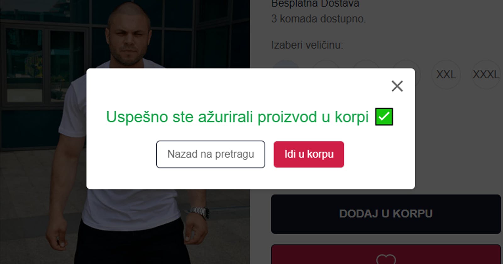
This is an example of how I implemented it on my e-commerce website, Roomy.
You can just copy-paste the code
Function
//helper function that you can use all the time for modals in every project
import { useEffect } from "react";

export default function useClickOutside(ref, fun) {
  useEffect(() => {
    const listener = (e) => {
      if (!ref.current || ref.current.contains(e.target)) {
        return;
      }
      fun();
    };

    document.addEventListener("mousedown", listener);
    document.addEventListener("touchstart", listener);

    return () => {
      document.removeEventListener("mousedown", listener);
      document.removeEventListener("touchstart", listener);
    };
  }, [ref, fun]);
}
JSX
//example from my ecommerce platform, modal for going into cart
import { useRef } from "react";
import CloseIcon from "@mui/icons-material/Close";
import useClickOutside from "@/utils/clickOutside";
import styles from "./styles.module.scss";
import Link from "next/link";

const AddProductToCartModal = ({ setShowModal, text }) => {
  const menu = useRef(null);
  useClickOutside(menu, () => {
    setShowModal(false);
  });

  return (
    <div
      className={`${styles.zindex} p-1 fixed top-0 left-0 right-0 bottom-0 bg-black/70 flex justify-center items-center`}
    >
      <div className="w-[500px] bg-white rounded-md shadow-md p-3" ref={menu}>
        <div className="flex items-center mb-4 justify-between">
          <div className=""></div>
          <div
            className="font-black cursor-pointer"
            onClick={() => {
              setShowModal(false);
            }}
          >
            <CloseIcon sx={{ fontSize: 30 }} />
          </div>
        </div>
        <div className="text-2xl mb-[16px] text-center text-green-600">
          {text}
        </div>
        <div className="flex justify-center mb-5 mt-5 gap-3">
          <div
            className="border border-darkBlueColor cursor-pointer rounded-md py-2 px-4"
            onClick={() => setShowModal(false)}
          >
            Nazad na pretragu
          </div>
          <Link href={"/korpa"}>
            <div className="border rounded-md py-2 px-4 cursor-pointer bg-violetColor text-white">
              Idi u korpu
            </div>
          </Link>
        </div>
      </div>
    </div>
  );
};

export default AddProductToCartModal;
Code explanation
useClickOutside function that you can use in every project
We have a helper function called useClickOutside. This function will be useful for handling the behavior of the modal when a click occurs outside of it. It helps us close the modal when we click anywhere outside its boundaries. The useClickOutside function takes two arguments: ref: This is a reference to the component's DOM element. In our case, it refers to the modal container. fun: This is a function that will be called when a click happens outside the modal. In our example, it sets the setShowModal state to false, which effectively closes the modal. Inside the useClickOutside function, we set up an event listener using useEffect. The event listener is responsible for detecting clicks outside the modal.
When a click occurs (mousedown or touchstart events), the event listener checks if the clicked element is not within the modal (!ref.current || ref.current.contains(e.target)). If the click is outside, it calls the fun() function to close the modal.
AddProductToCartModal component
setShowModal: This is a state updater function that will be used to control the visibility of the modal. text: This prop contains the text that will be displayed in the modal. We use the useRef hook to create a reference called menu. This reference will be used to keep track of the modal container.
Next, we use our useClickOutside function by passing in the menu reference and a function that closes the modal when clicked outside.
The component renders a modal container, which is a dark semi-transparent background with the main content in the middle.
Inside the container, there is a close button represented by the "x" icon. When this button is clicked, the setShowModal(false) function is called, which closes the modal.
The text prop is displayed in the modal's content area.
There are two buttons at the bottom of the modal: "Nazad na pretragu" button: When clicked, it calls setShowModal(false) and closes the modal. "Idi u korpu" button: When clicked, it uses the Link component to navigate to the "/korpa" route. The styles are applied to format the modal, such as its width, background color, text size, and positioning.
